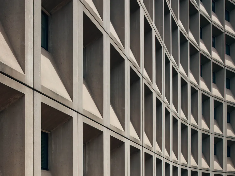
The FBI headquarters in Washington, D.C. is a looming mass of concrete with rows of identical square windows spread across two city blocks. Many consider the Brutalist behemoth, officially called the J. Edgar Hoover Building, to be the most unsightly structure in the city. Last year, it made headlines when construction supplier Buildworld ranked it as the ugliest building in the United States—and the second-ugliest building in the world, after the Scottish Parliament Building in Edinburgh.
It’s easy to find Washingtonians who agree with this assessment. Earlier this month, NPR’s Kaity Kline stood outside the hulking structure and asked passersby for their thoughts. Nobody she interviewed had anything nice to say.
“I can’t stand it,” Arielle Carani, a 24-year-old who works across the street from the building, told NPR. “I have to look at it every day that I’m in the office. And it’s just so ugly.”
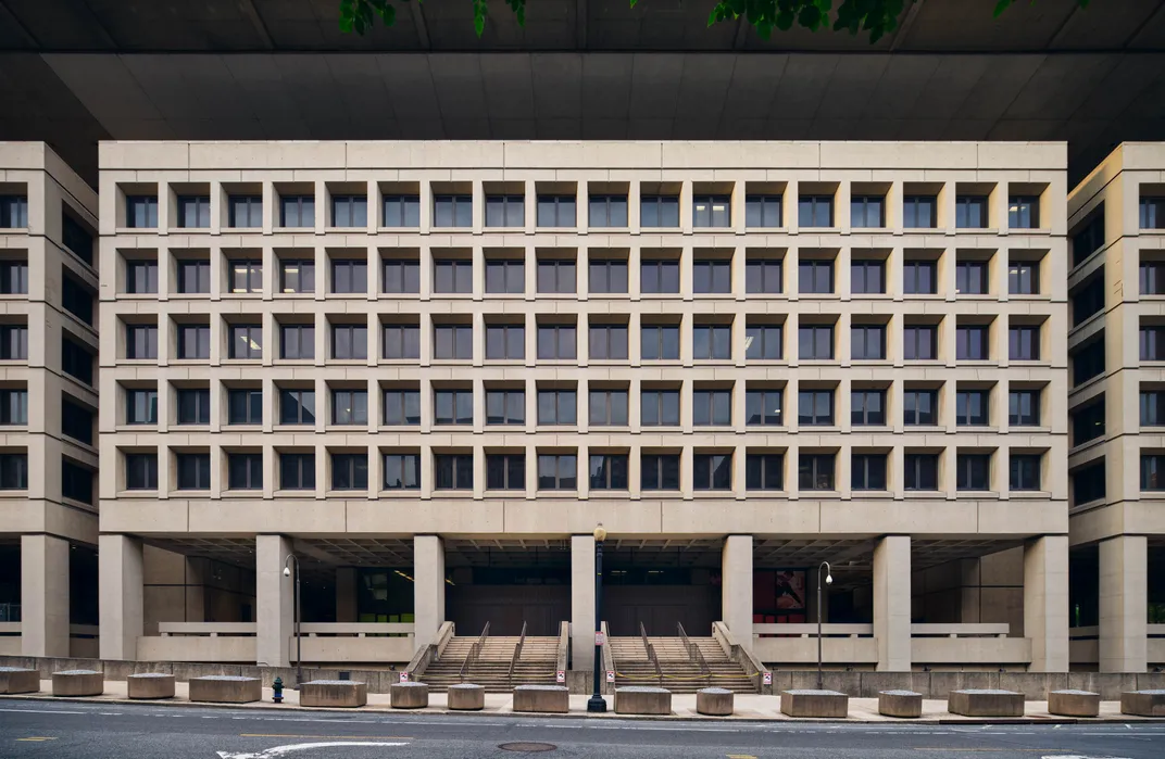
Brutalism is a divisive architectural style that prizes function over form and intentionally eschews unnecessary ornamentation. Buildings designed in this style are usually made of exposed concrete, and they often feature stark geometric patterns, deep-set windows, simple lines and unpainted surfaces. Examples of Brutalist architecture can be found all over the nation’s capital, where residents love to hate them.
Now, an exhibition at the National Building Museum in Washington poses an intriguing question: What if we could fix them?
Titled “Capital Brutalism,” the show is the largest-ever survey of Washington’s Brutalist architecture. Photos, drawings and archival documents are on display to examine “the enduring legacy of Brutalist architecture, whose beauty often goes unnoticed,” per a statement from the museum.
The exhibition focuses on seven of the city’s most contentious Brutalist buildings, as well as the Metro system. Even as curators celebrate the controversial style, they are well aware of how much hate Brutalism continues to generate. As such, they have invited top architecture firms to imagine how they would redesign each of the featured buildings.
So, what did architects make of the famously reviled FBI building? According to the Washington Post’s Michael O’Sullivan, “Gensler, an architecture firm known for its philosophy of ‘hackable’ buildings, proposes putting a soccer field on top and repurposing offices as big-box retail and a hotel.”
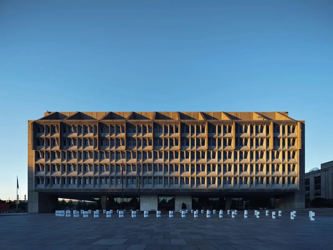
What about the Hubert H. Humphrey Building, which houses the Department of Health and Human Services? The boxy eight-story structure with narrow, recessed windows could give the FBI headquarters a run for its money. Last summer, the Post’s Dan Diamond and Samantha Latson spoke with more than a dozen current and former staffers who had worked in the building—and who were willing to air their grievances about it.
“It’s so ugly, it’s beautiful,” said Andy Slavitt, who ran the Centers for Medicare and Medicaid Services between 2015 and 2017. Other staffers were more diplomatic, describing the building as “functional” and “kind of sad-looking.” One even charitably shifted attention away from the structure itself and onto the “beautiful things” happening inside.
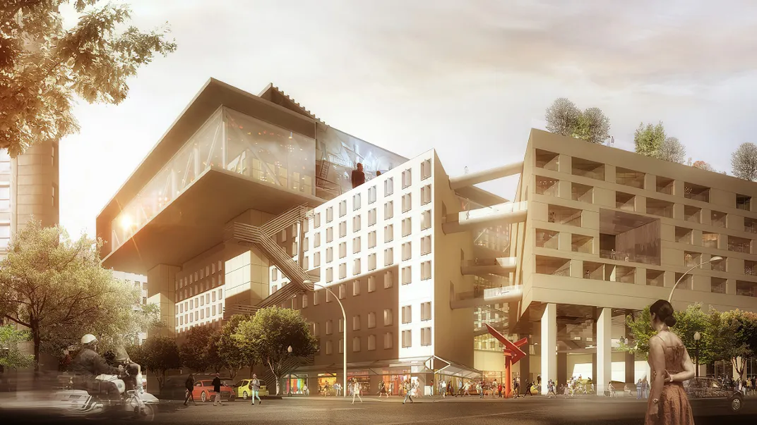
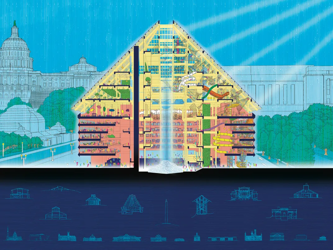
In “Capital Brutalism,” architects with the firm BLDUS reimagined the building as the headquarters for the so-called “Department of Play,” a massive, multi-story playground full of spiral slides and climbing apparatuses. The facility would also feature a daycare center, affordable dining and other amenities.
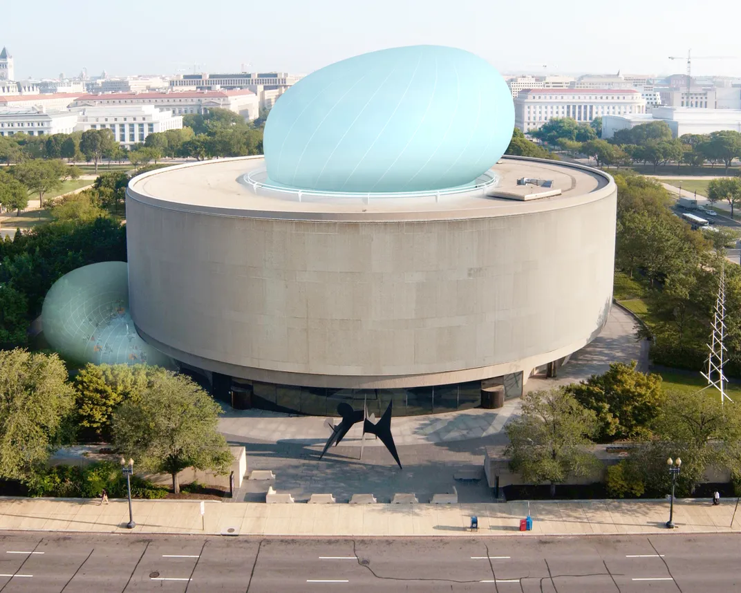
Another featured building is the Smithsonian’s Hirshhorn Museum and Sculpture Garden, a doughnut-shaped concrete structure with a central courtyard. Instead of asking architects to redesign the building, curators decided to revisit a real plan that was floated in 2013: This proposal involved a massive bubble that would be placed in the middle of the courtyard and inflated several times throughout the year. Ultimately, officials decided against it.
“The plan failed,” writes Bloomberg’s Kriston Capps, “but the drawings represent the kind of formalist thinking—about massing and material and permanence and possibility—that responds to Brutalism on its own terms.”
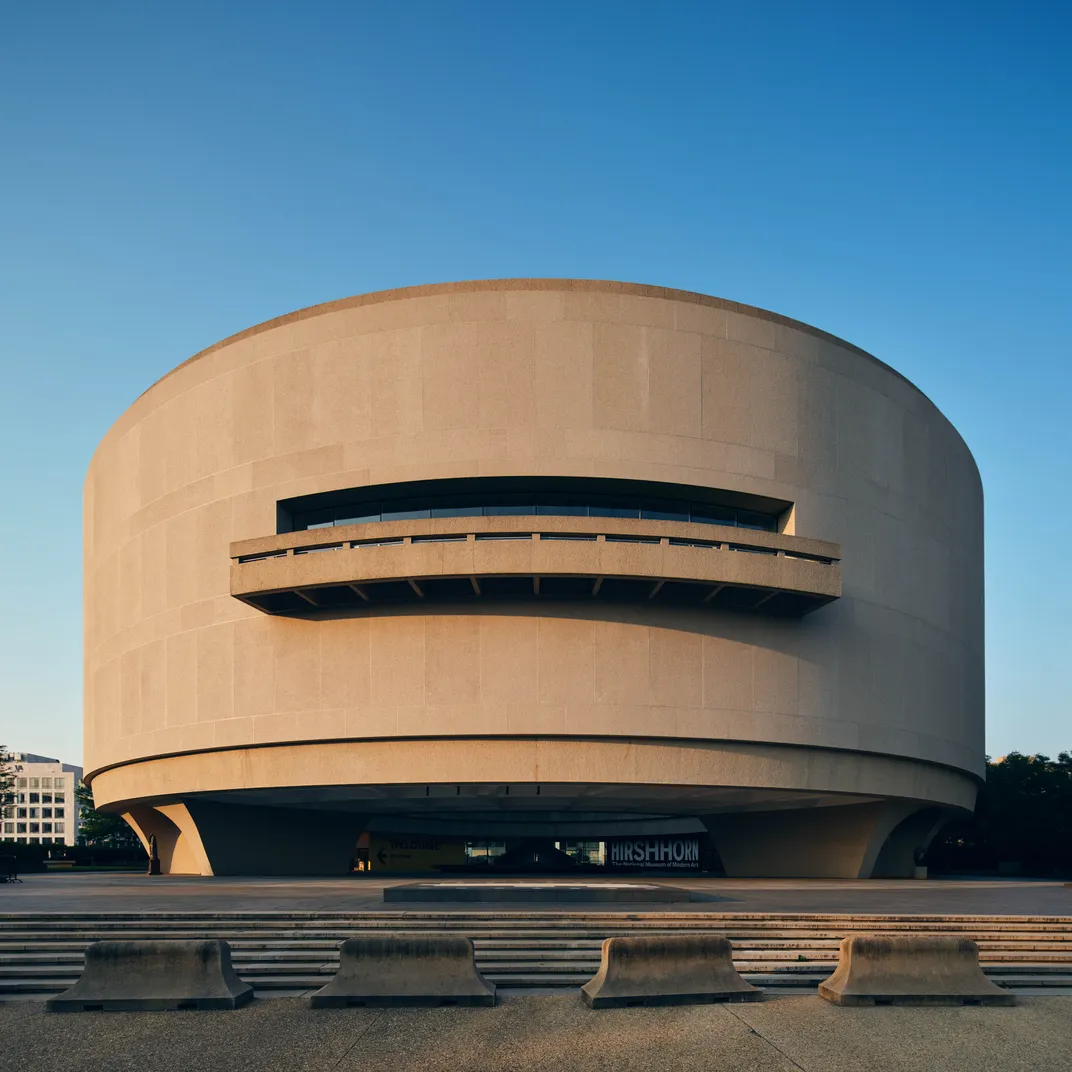
Brutalism was born in Europe in the wake of World War II, as officials around the world considered how to rebuild their cities. The idea of long-lasting, practical and affordable architecture became increasingly popular, and the style eventually spread across the Atlantic Ocean.
The word “Brutalism” comes from the French term beton brut (“raw concrete”). Many historians attribute the name to the Swedish architect Hans Asplund, who coined it in 1949 while jokingly referring to Villa Göth, a no-frills brick residential building in Sweden.
The style became pervasive in Washington throughout the 1960s and ’70s, and all seven of the buildings in “Capital Brutalism” date to this period. Since their construction, the style has declined in popularity. Most of these structures are more than half a century old, and many have fallen into disrepair.
Brutalist buildings can be difficult to renovate, but opting to demolish them comes with its own host of problems. Knocking down such large concrete structures produces carbon emissions, and experts say the most sustainable path forward is to preserve them.
“If you tear them down, it’s so wasteful that it’s really criminal in a way,” Jeanne Gang, founder of the architecture firm Studio Gang, told NPR. Instead, she added, “you could be building on these interesting buildings and [making] them work for today.”
Meanwhile, some believe that these buildings are already working just fine. Brutalism has a small but dedicated fanbase, whose supporters believe (with apologies to John Keats) that “beauty is truth”; that honesty has an aesthetic appeal.
“If modernism is about architecture being honest, Brutalist design is about architecture being brutally honest,” Geddes Ulinskas, principal of Geddes Ulinskas Architects, told Architectural Digest’s Katherine McLaughlin last year. “Forms are as simple as can be, and materials are stripped to be as bare and raw as possible.”
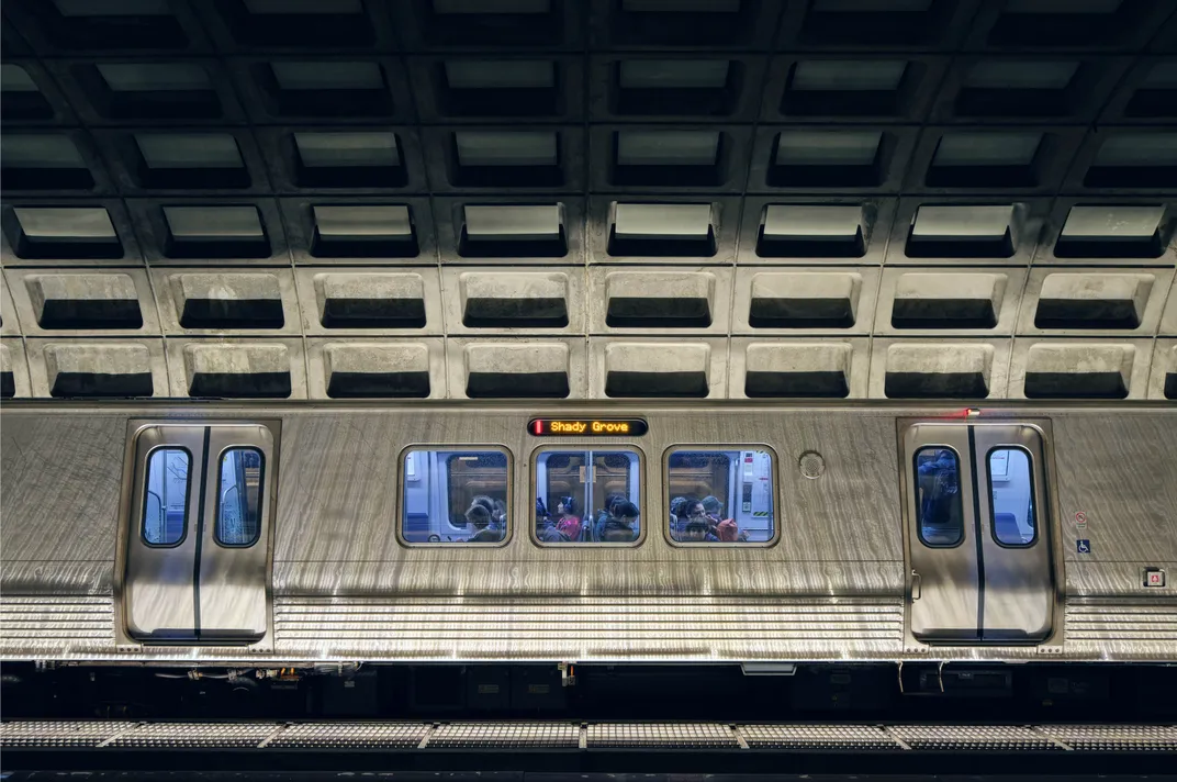
Given these guidelines, Brutalism’s defenders are vehemently against attempts to add ornamentation to these structures. In 2017, for instance, officials in Washington decided to cover some of the concrete slabs inside the city’s Metro stations with white paint. A small but vocal contingent was outraged, insisting that the city must “keep Metro bleak!”
Brutalism’s “stripped-down philosophy” reflects a set of values—“restraint over excess, function over flair,” as the Post’s Kelsey Ables wrote in 2021. “To appreciate Brutalist architecture is to embrace the essence of things.”
If brutal is beautiful, the bleaker the better.
“Capital Brutalism” is on view at the National Building Museum in Washington, D.C. through February 17, 2025.
Editor’s note, August 28, 2024: This story has been updated with more information about the reimagined Humphrey building.
