This Graphic Artist’s Olympic Pictograms Changed Urban Design Forever
Having lived through Germany’s Nazi regime, Otl Aicher went on to pioneer democratic design
/https://tf-cmsv2-smithsonianmag-media.s3.amazonaws.com/filer/d4/0c/d40c0336-6e43-45ba-9d86-1c32ca72b755/16042256942_95512cc191_o.jpg)
As the Olympic Games begin in Tokyo, participants face a familiar challenge. Athletes, officials and staff arriving from all over the world need to be able to find their way around without a common language. For decades, one solution to this problem has been pictograms, a spare visual language capable of explaining everything from where swimming events will be held to how to catch a train.
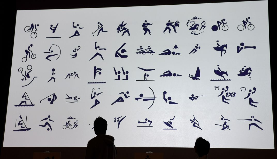
Artistic director Masaru Katzumie and graphic designer Yoshiro Yamashita pioneered the concept in Tokyo in 1964, creating 20 pictograms depicting particular sports and 39 others communicating information like where to find the toilets or first aid. Mexico City had its own version four years later, using stylized images of equipment and body parts to depict each sport and incorporating a color scheme to distinguish different types of events. But one of the most influential figures in developing the language was Otl Aicher, a German whose commitment to universal design was shaped by his experience with some of the greatest horrors committed in the name of nationalism.
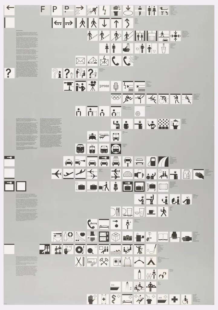
A poster of Aicher’s pictograms for the 1972 Summer Olympics in Munich, part of the Cooper-Hewitt, Smithsonian Design Museum’s collection in New York City, shows 166 pictograms, mainly conveying practical information like where to find stairs, bathrooms and transit. A museum-quality reproduction of the poster will be on display in the Smithsonian’s upcoming “Futures” exhibition, opening in November at the Arts & Industries Building in Washington, D.C. The show explores the possibilities of new ideas and technologies, including their capacity to unite diverse groups of people, as Aicher’s pictograms did for people coming together across language barriers.
Consulting curator Glenn Adamson says Aicher’s pictogram designs have influenced signs like the ones in airports and bus stations all over the world—markings that are so familiar we often take them for granted. “It’s almost like Shakespeare—you can forget how innovative it was,” he says.

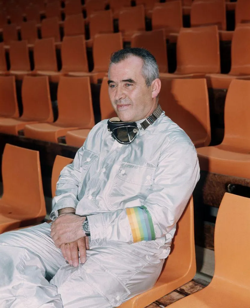
Aicher was born in Ulm, Germany in 1922. Growing up, he was a close friend of Werner Scholl, whose family is legendary for their resistance to the Nazi regime. Aicher went on to marry Werner’s sister, Inge. Two other Scholl siblings, Hans and Sophie, were leaders in the White Rose Society, one of the few non-Jewish youth resistance groups speaking out against the Nazis from inside Germany.
In 1937, Aicher was arrested after refusing to join the Hitler Youth. After being drafted into the army to fight in World War II, he made several attempts at desertion, eventually escaping to hide at the Scholl residence in 1945. “He was risking his life in doing that,” Adamson says. In 1943, the government had executed Hans and Sophie for their distribution of anti-Nazi pamphlets.
Following the war, Aicher studied sculpture at the Academy of Fine Arts, Munich, and then launched his own studio in Ulm. In 1953, he, Inge and Swiss artist and designer Max Bill founded the Ulm School of Design. Ellen Lupton, senior curator of contemporary design at the Cooper Hewitt, Smithsonian Design Museum, says, until it closed in 1968, the Ulm School pursued a coherent, scientific design methodology.
“They were interested in the science of language, the science of persuasion,” Lupton says.
To some extent, the Ulm School followed in the steps of the Bauhaus, a school of design known for its functional, modernist art before the Nazis shut it down in 1933.
“If the Bauhaus was an experiment, the Ulm school was about creating a practical methodology based on science, research and definable principles,” Lupton says.

Most graphic designers had previously created product packaging and advertisements by assembling a number of disparate images, fonts and decorative designs, Lupton says. Aicher’s work helped lead to an entirely different aesthetic, seen in the sleek corporate logos that adorn sneakers, shipping boxes and stadiums today, and a holistic approach to design. Working with brands including audio equipment maker Braun, the Lufthansa airline and Railroad Hamburg, the Ulm school helped establish “brand identity”—a new concept at the time. For Lufthansa, for example, Aicher and his team chose a warm “melon yellow” color and the lowercase Helvetica Bold font, redesigned the company’s logo of a crane, and, in doing so, created a highly recognizable look that the company adopted across its materials.
“It’s the logo and what font goes with it, and how those things are presented in space,” Lupton says. “Are they centered? Are they flush left? It’s really about creating a whole system.”
The Ulm school helped establish Germany as a center of design in the postwar world.
“They were using modernism partly to express what good design is,” Adamson says. “But they were also very successfully, and quite literally, rebranding Germany.”
This was a time when people around the world were still reeling from the horrors of the Holocaust. As the successor to the Bauhaus movement, which was widely known for its opposition to Nazism, Adamson says, the Ulm school’s image was ideologically “clean,” which helped them attain international success with their commercial work.
“Suddenly along comes this group of younger Germans that present a totally new face of the country that’s enlightened, universal, rational,” Adamson says. “It’s quite moving when you think about it—these young people operating in this incredibly traumatic situation trying to find a new way to identify with their own country.”
Lupton says sleek modern design appealed to many people in the postwar period in a way that may be hard to grasp today.
“We look at it and go ‘Oh, it’s so corporate,’” she says. “But these principles aimed to be super democratic and universal. It was like the opposite of fascist design.”
Fascist powers often use design to harken back to an imagined past of racial or national unity. So, for example, ornate blackletter fonts were once a signature of the Nazi Party. The Ulm school instead embraced simple, modern fonts seen as inclusionary.

Then, in 1972, the Olympics came to Munich, and Aicher was named lead designer. Today, if we remember those games it’s usually for the terrorist attack that disrupted them. The Palestinian group Black September took Israeli athletes hostage, ultimately killing the hostages, a West German policeman and five of their own. But, at the time, Adamson says, Aicher was thinking about the last time Germany hosted the Olympics in 1936, when Adolf Hitler used the Berlin games as a propaganda opportunity, toning down the violent, racist rhetoric of his regime to feign a more peaceful image for foreigners.
“[Aicher] comes in and he’s super conscious about how to respond to the precedent of the ‘36 Olympics,” Adamson says. “Make the ‘72 Olympics totally different.”
The pictograms for the Tokyo Summer Games are the first in the history of the Olympics to be kinetic.
Under Aicher’s leadership, the colors of the games were a palette of light, fresh shades of blue, green, silver, orange and yellow. In a playful gesture, the closing ceremonies included the display of a long, helium-filled rainbow balloon designed by German artist Otto Piene, known for his kinetic artwork.
“There will be no displays of nationalism and no giantism,” Aicher wrote at the time. "Sport will not be seen in relation to military discipline or as preparation for it.”
According to Lupton, Aicher’s innovation was creating a universal system, using a grid to lay out stick figures along vertical and diagonal lines.
“He really wanted to make it like an alphabet,” she says. “It’s like making a font, but it’s a font of human body parts.”
Adamson points to the way Aicher’s pictograms—schematic stick figures showing a figure angled at 45 degrees kicking a ball or bent over a bicycle—contrast with “heroic” bodies and intense attention to race and gender in Nazi propoganda like Olympia, Leni Riefenstahl’s film of the 1936 Olympics.
“These are non-heroic,” he says. “Even though it’s Olympic athletes that he’s showing you, he’s showing it in a way that it could be you or it could be your kid.”
Aicher applied the same design principles used in his symbols for sports to symbols for toilets, stairs, trains and everything else people might need to find.

After the 1972 Olympics, the pictograms inspired sign makers outside the sports world, starting with the United States Department of Transportation, which developed its own system of symbols in 1974. Prior to that, Adamson says, most signs in public spaces were made up of text, arrows and a small number of widely understood symbols, like the octagonal stop sign. Aicher-style pictograms, with their easily intuited meanings, spread worldwide within 10 to 20 years. Today, visitors can find their way around any airport or subway station using zig-zag symbols for “stairs,” simplified images of a baby’s diaper change, and familiar head-on views of a bus or train.
“The universalism he had in his mind actually did become universal in terms of graphic design,” Adamson says.
The upcoming “Futures” exhibition featuring the pictograms celebrates the Smithsonian’s 175th anniversary in part by looking at visions of the future created by people in decades past. The Arts and Industries Building, where it will take place, was known as America’s “Place of Wonders” when it first opened in 1881. In its storied history, the building has showcased new innovations from the electric light bulb to rocket ships. Adamson says the new exhibit will imagine futures that unite people, and at the same time embrace diverse experiences and visions.
“The genius of the pictograms is that it’s a single consistent language that also implies a huge amount of diversity,” says Adamson.
/https://tf-cmsv2-smithsonianmag-media.s3.amazonaws.com/accounts/headshot/Livia_lg_thumbnail.png)


/https://tf-cmsv2-smithsonianmag-media.s3.amazonaws.com/accounts/headshot/Livia_lg_thumbnail.png)